Feel free to contact me for downloading the actual font file to use :)
CHALLENGE
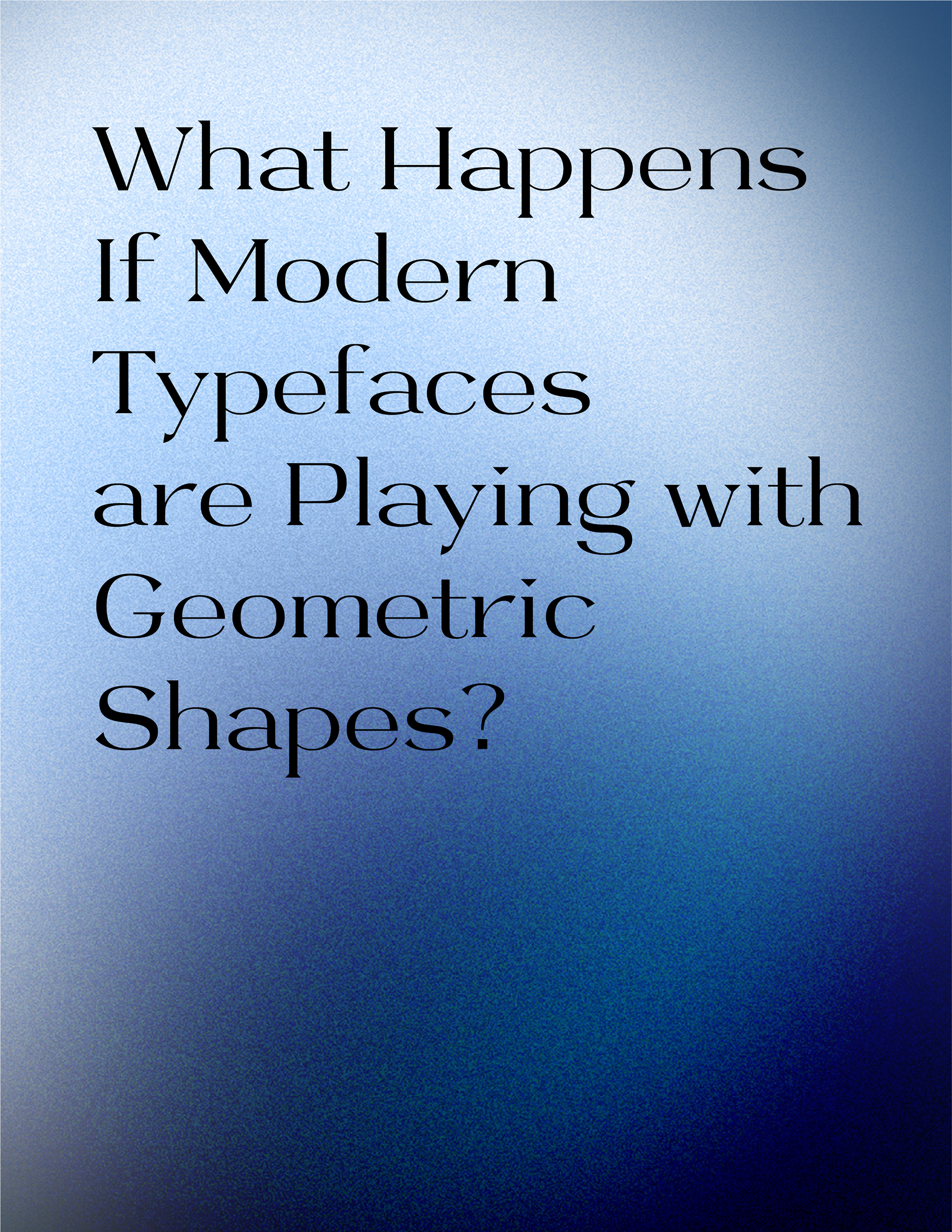
What happens if modern typefaces are playing with geometric shapes?
SOLUTION
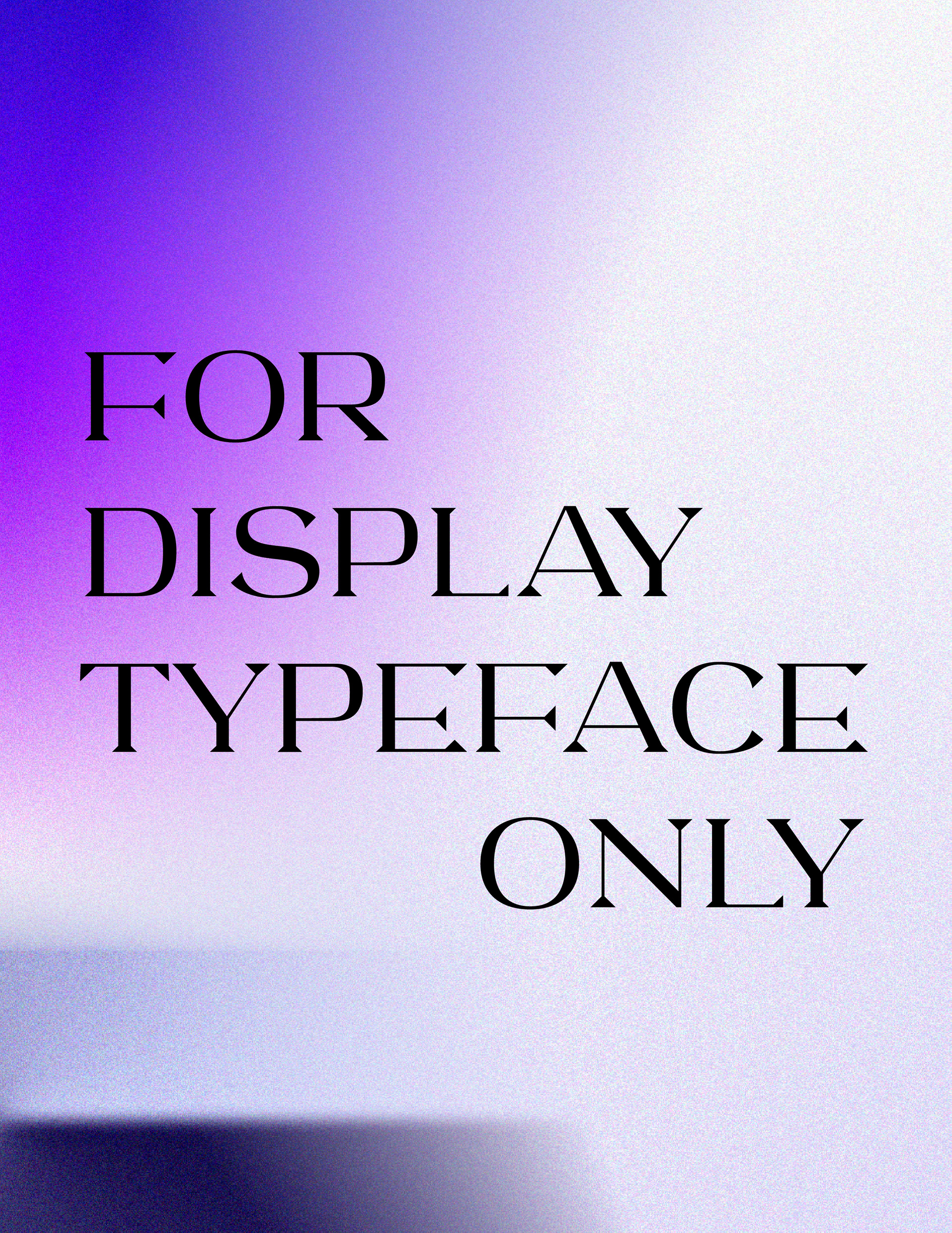
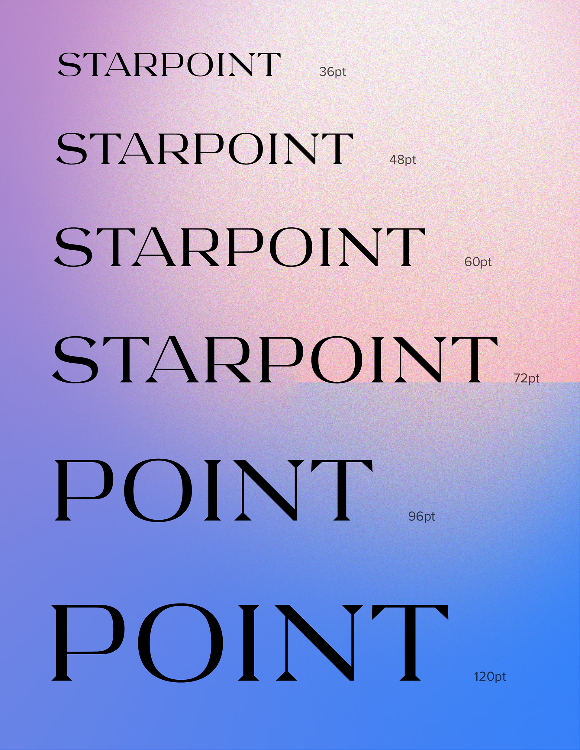
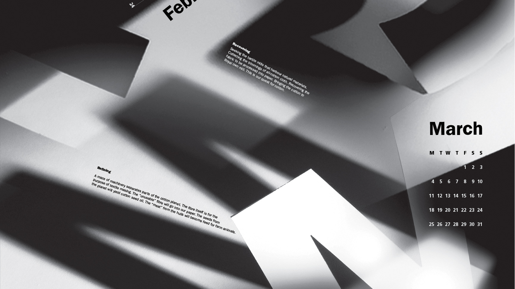
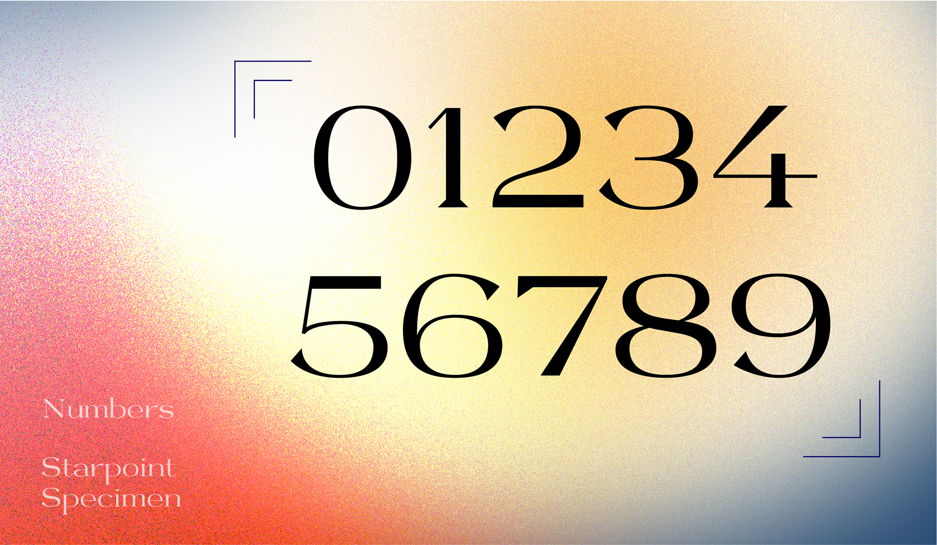
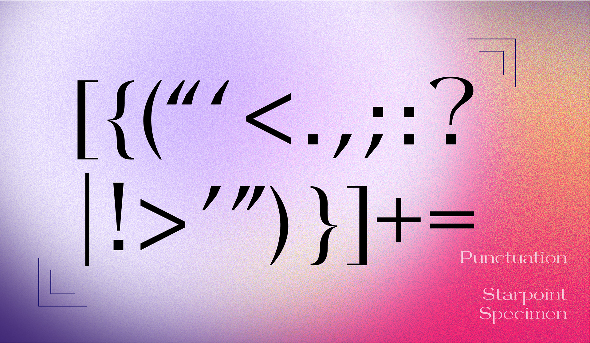
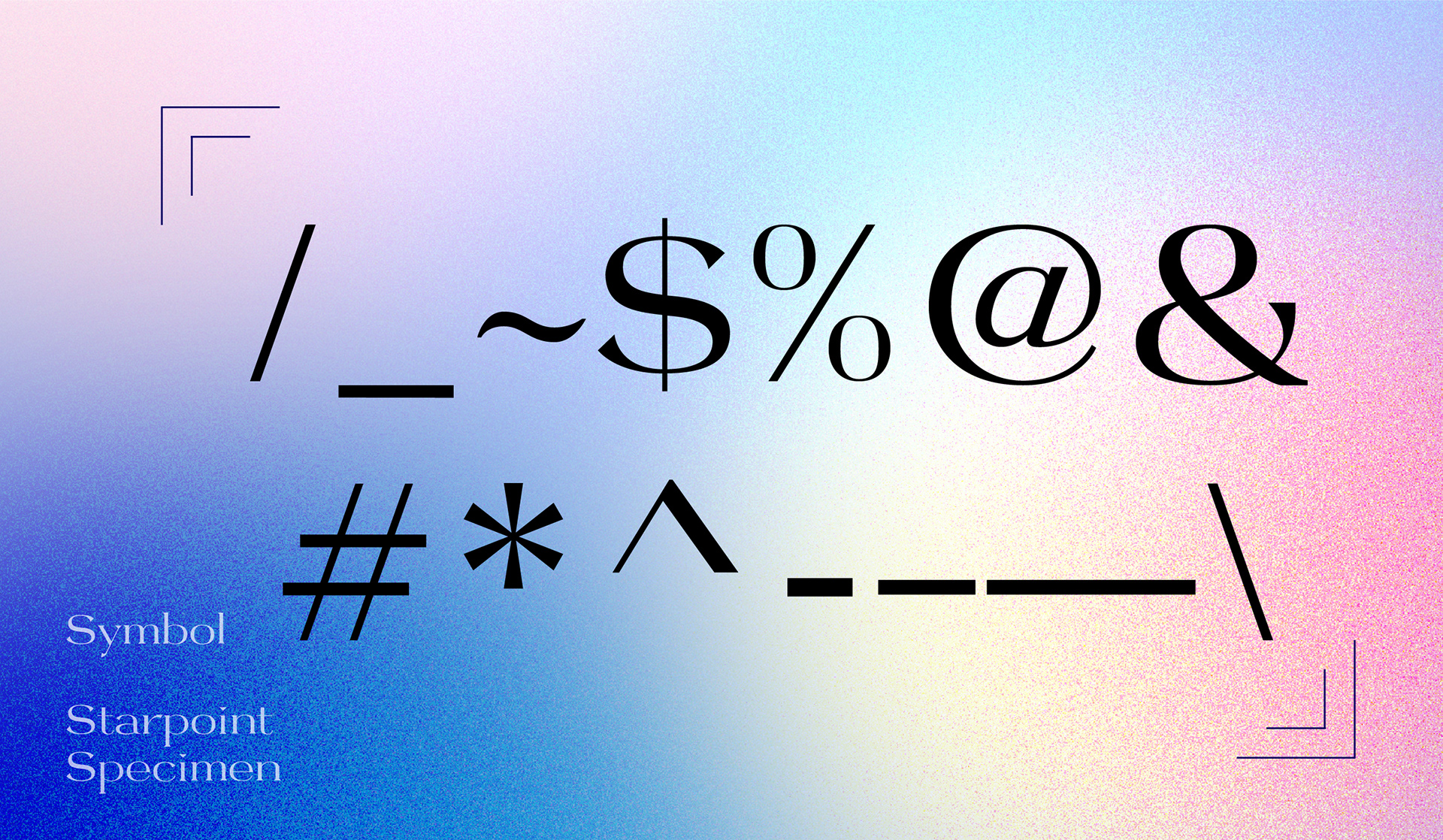
Starpoint was inspired by typical Modern typefaces such as Bodoni and Didot, with a fun aspect of merging with geometric shapes. The style has a wide letter width and short vertical proportion in general. The crossbar of letters is low and wide; the shoulders of letters are flat and less curved, forming a square structure, resonating with the main idea of implementing geometric shapes. The serifs are created by using triangular shapes, making the letters look sharp. The name "Starpoint" conveys the essence of the typeface. The balance between wide letterform structures and pointy serifs decreases the aggressive feeling and adds a lovely, cute approach to overall letterforms.
Starpoint is designed for display purposes. It is best used in larger point sizes for specific projects such as brand design, publication headlines, packaging titles, posters, etc.
Starpoint is designed for display purposes. It is best used in larger point sizes for specific projects such as brand design, publication headlines, packaging titles, posters, etc.
DESIGN TOUCH POINTS
Typeface design, Poster design, branding, packaging design
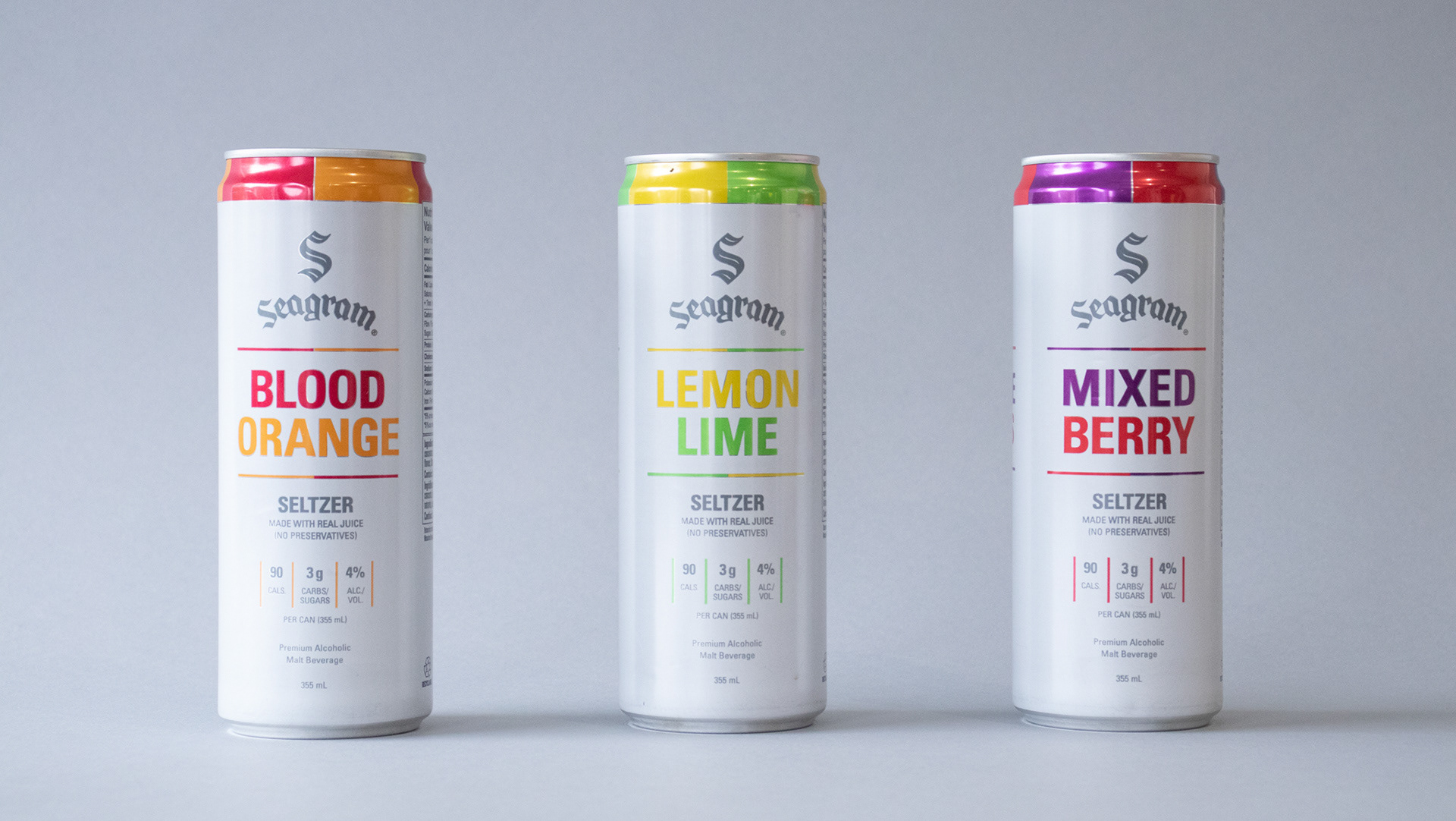
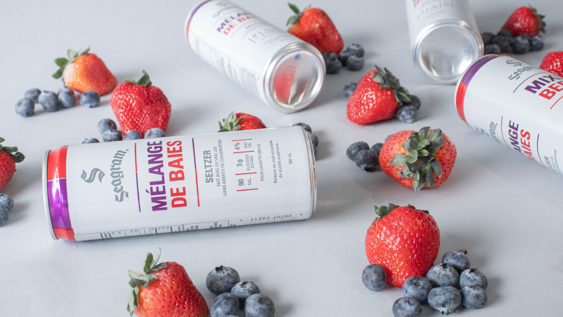
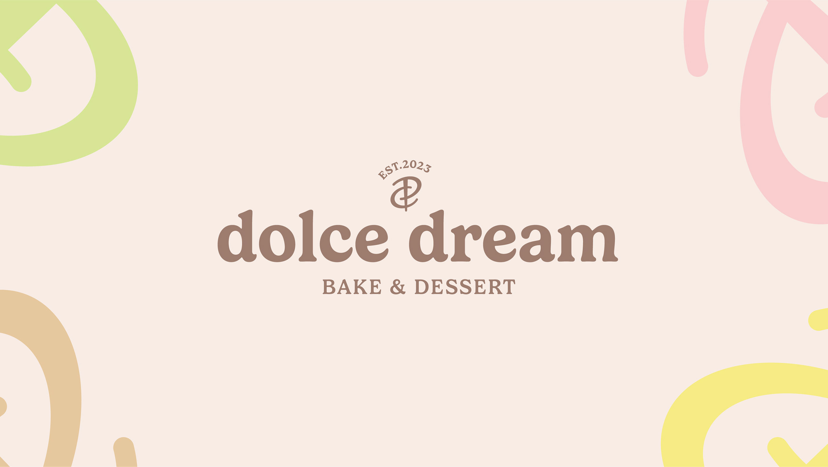
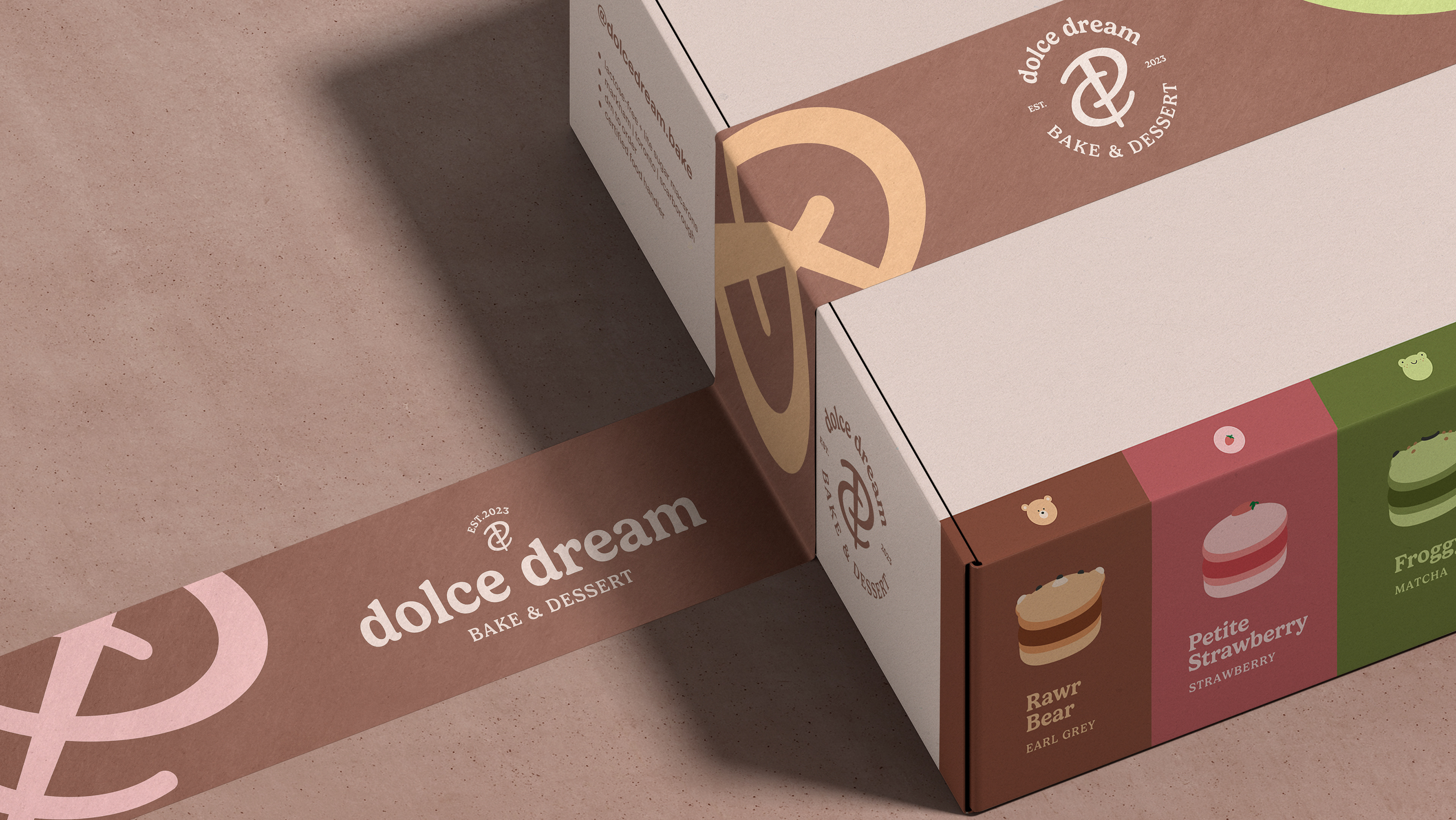
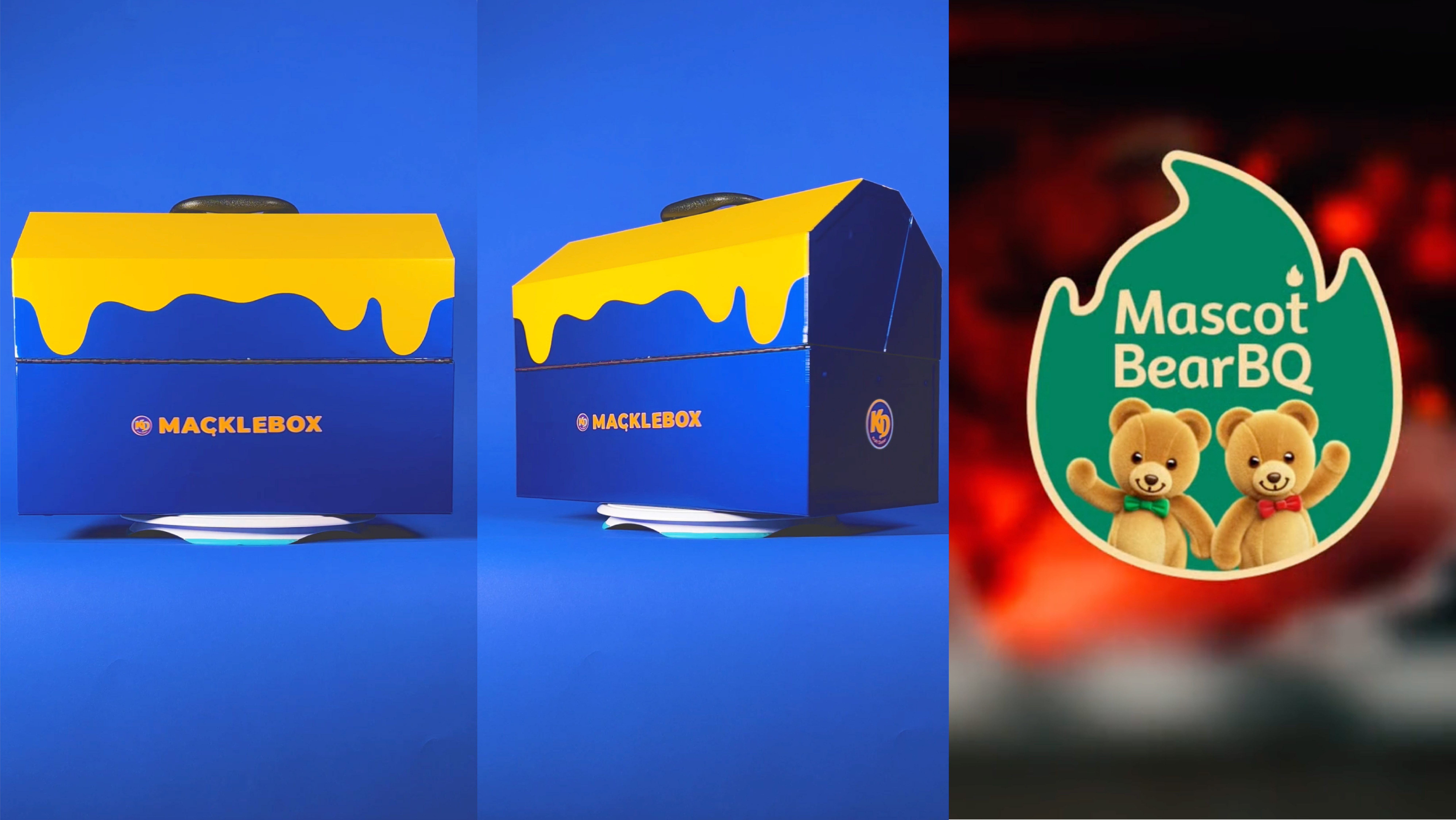
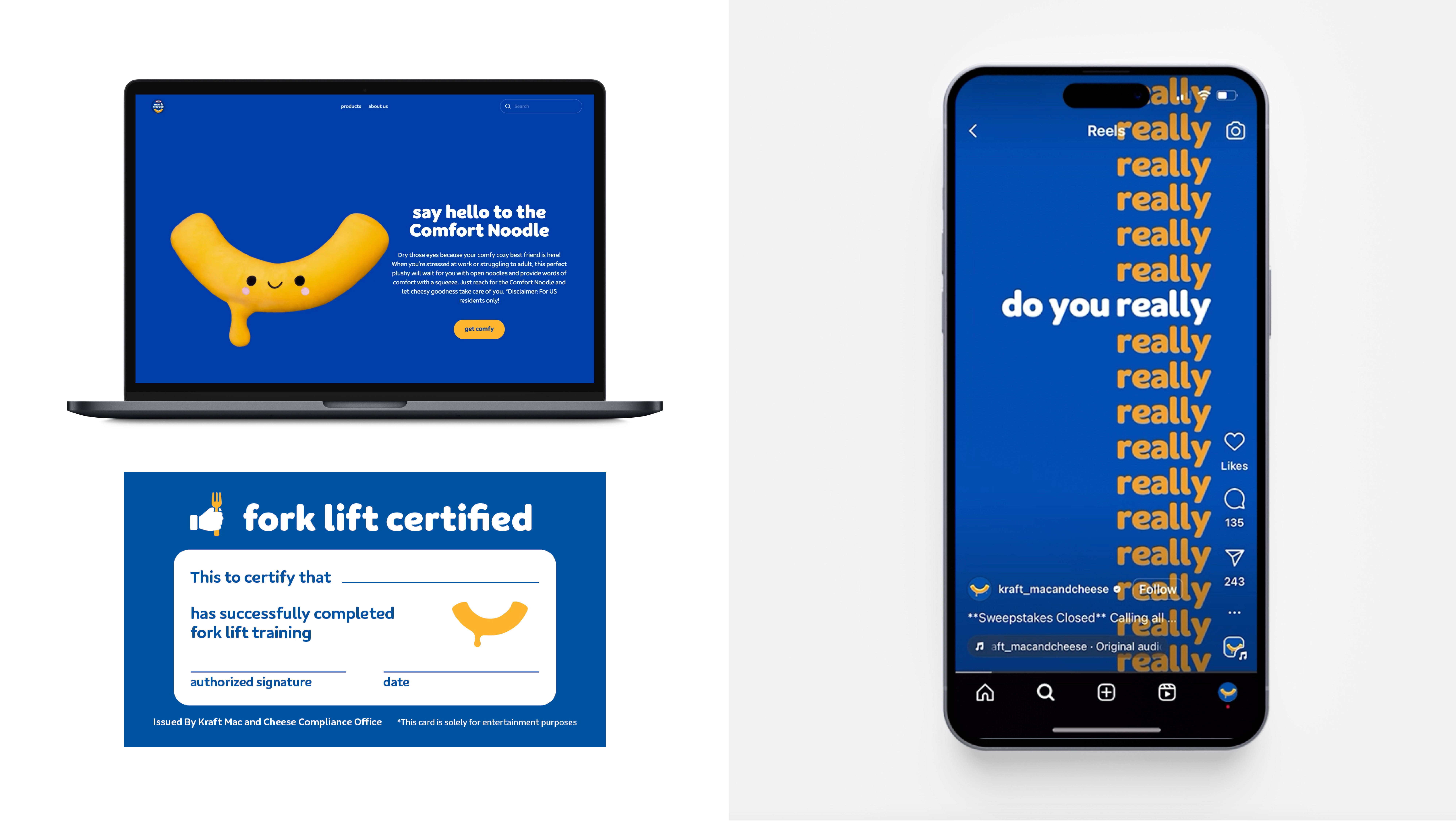
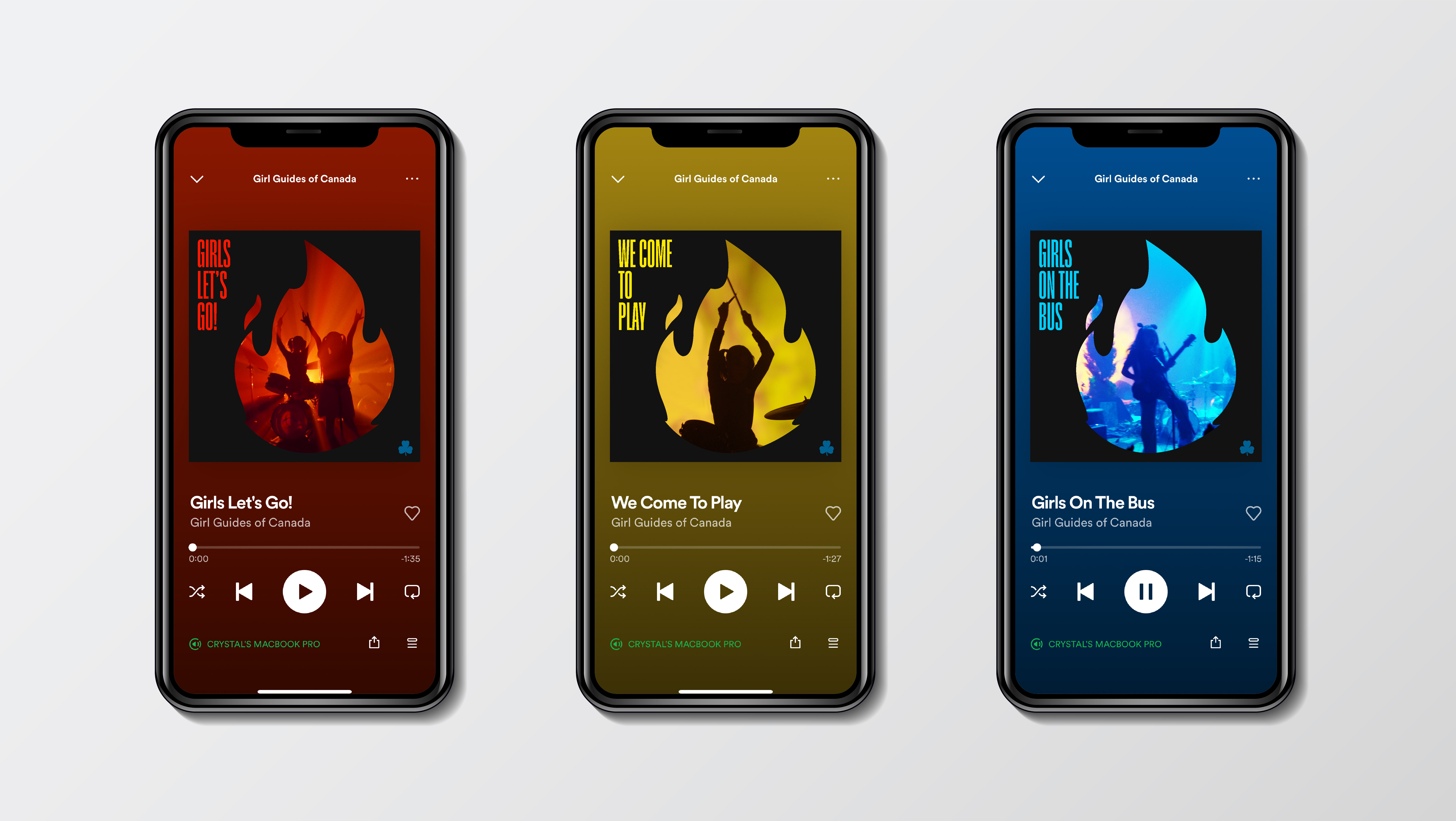
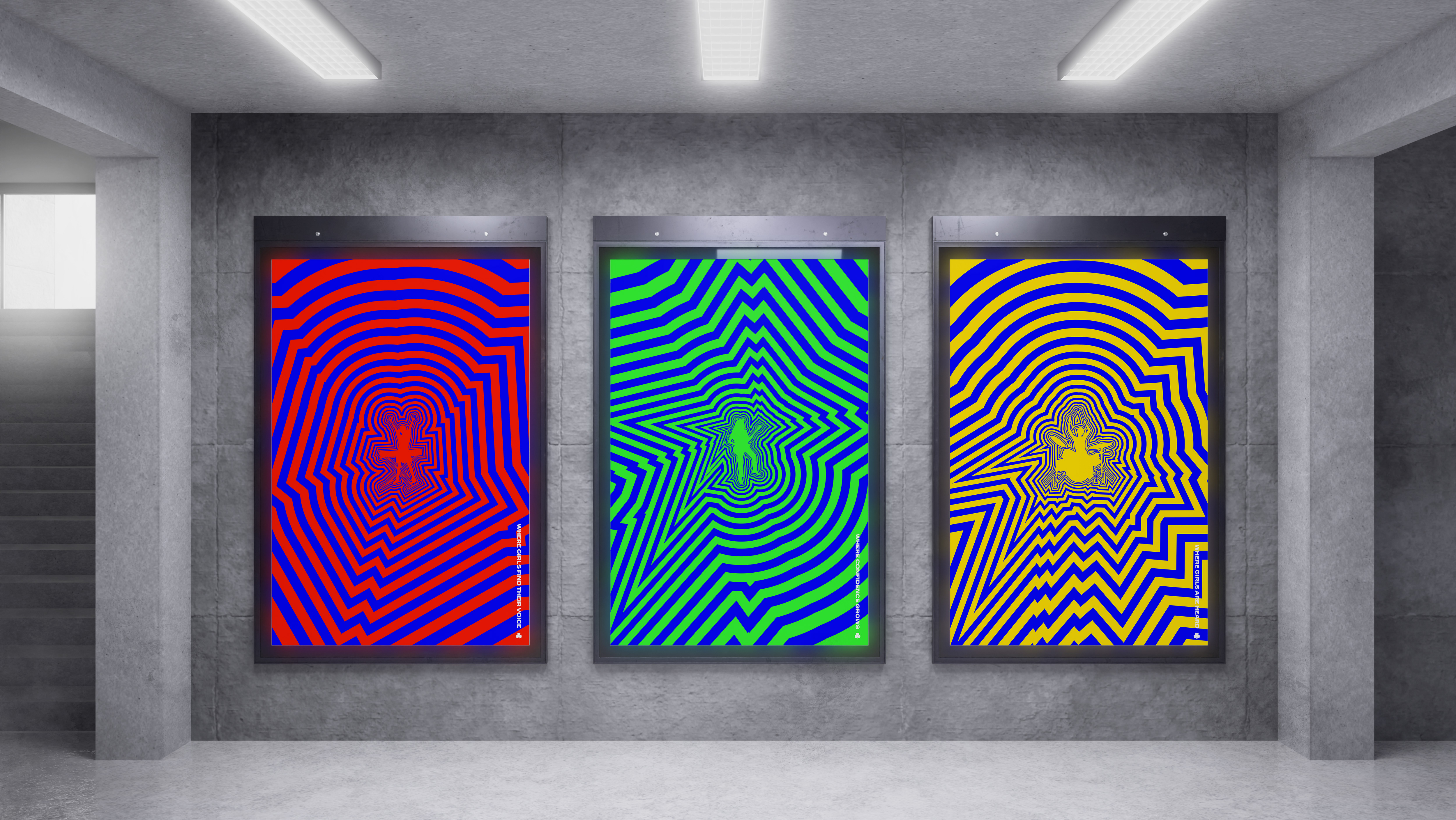
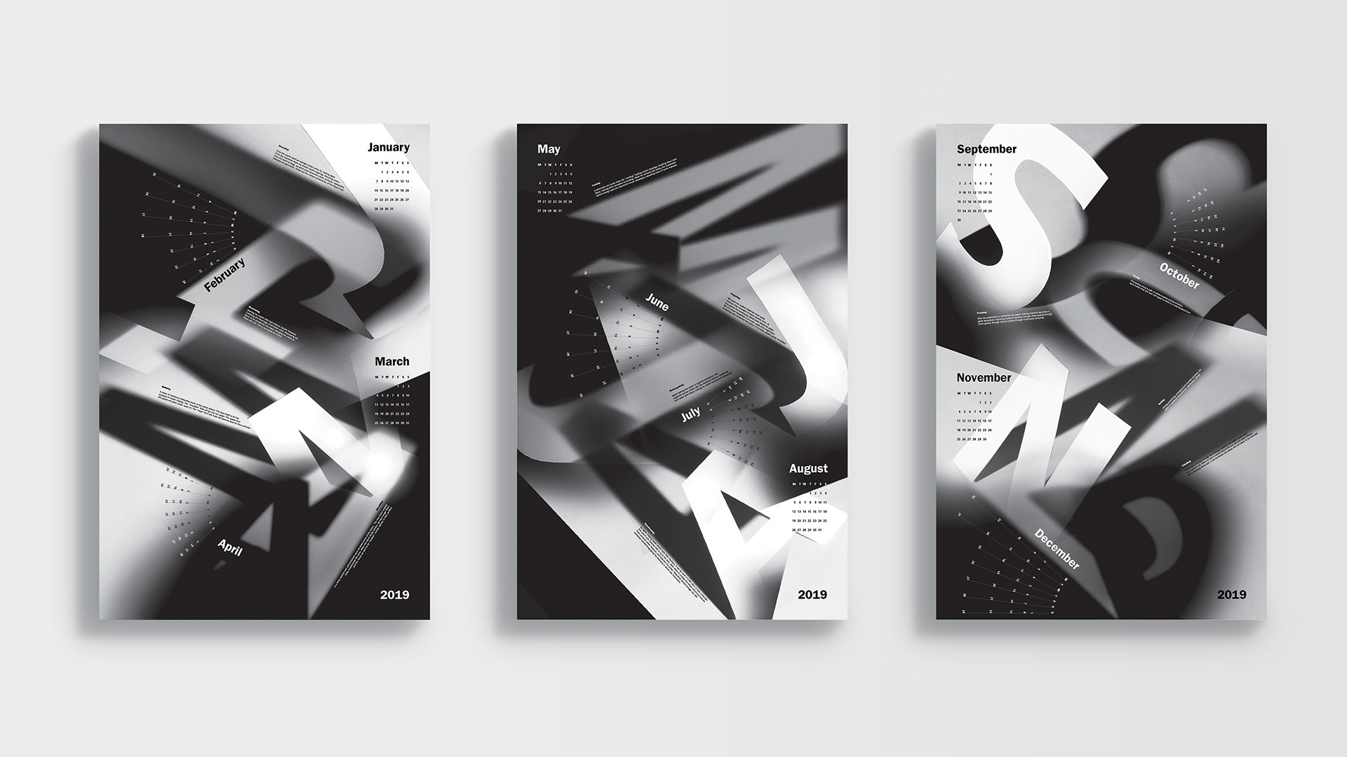
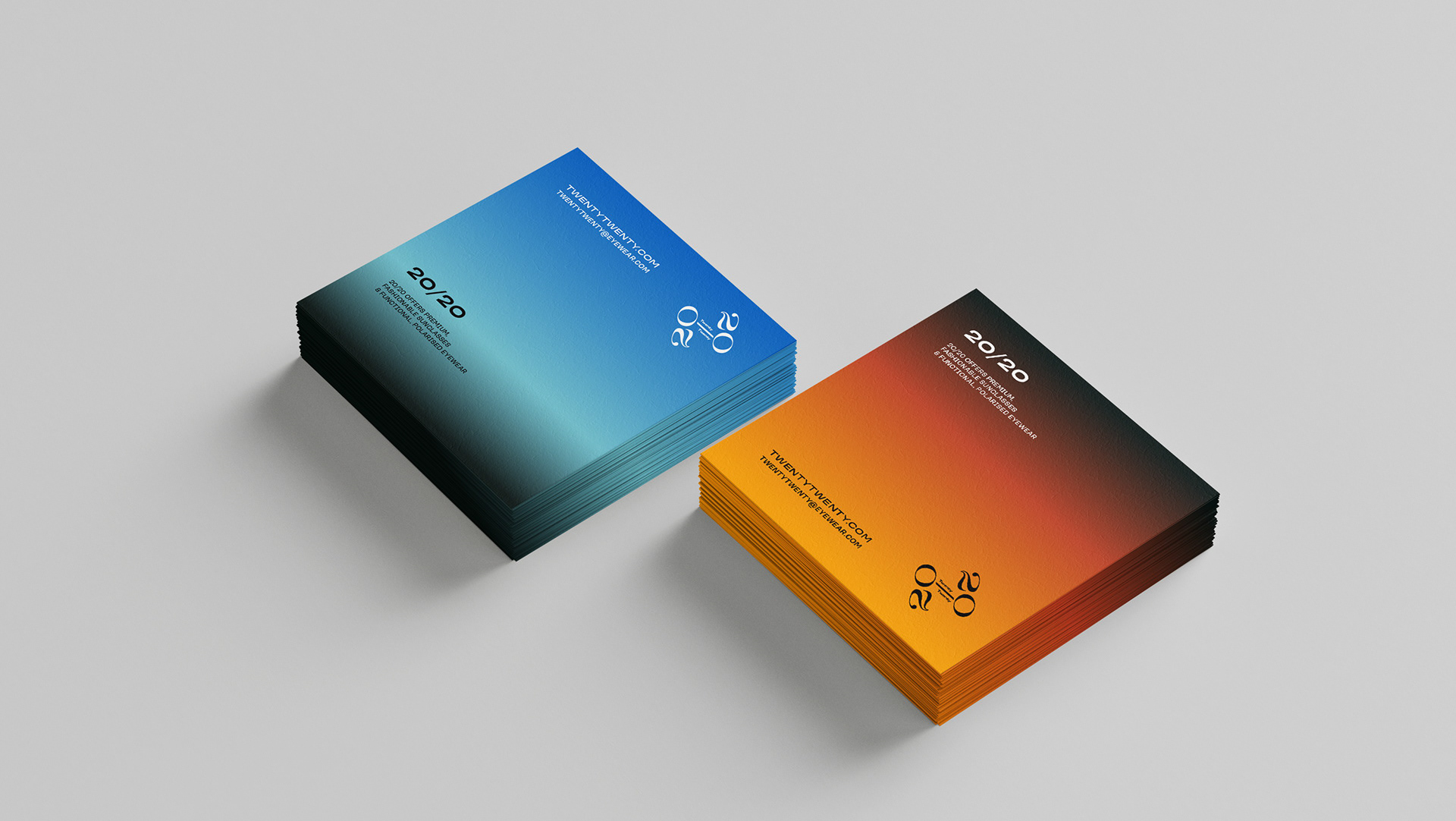
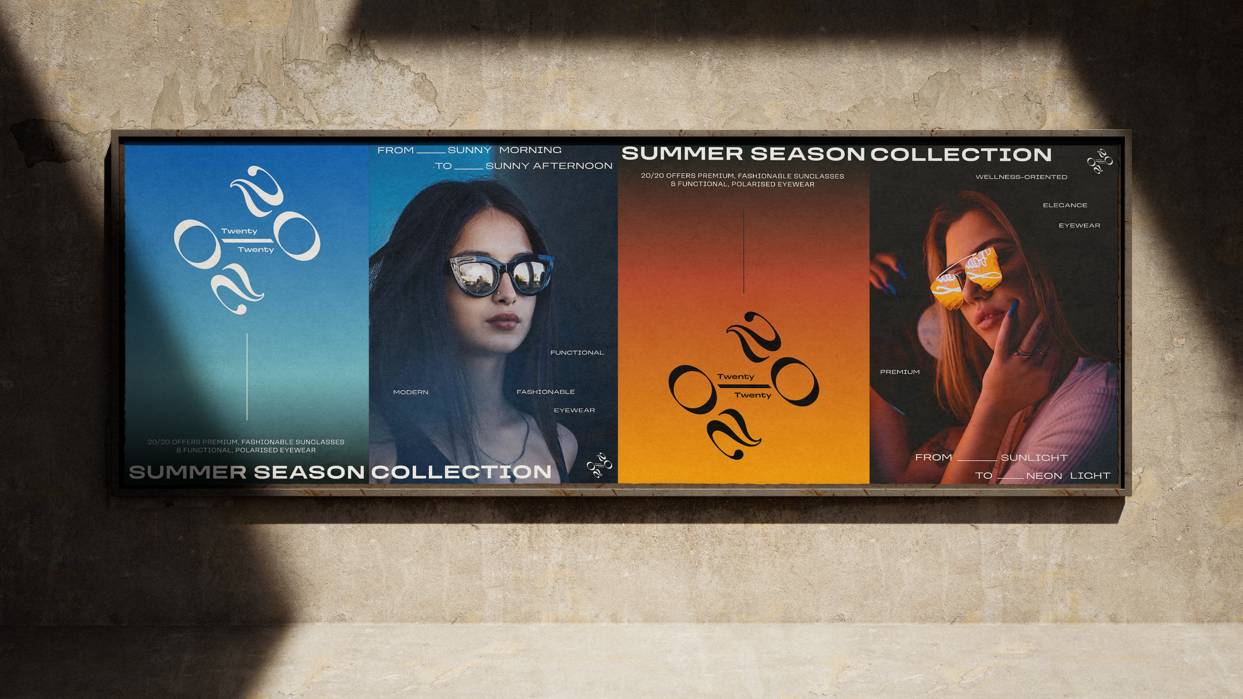
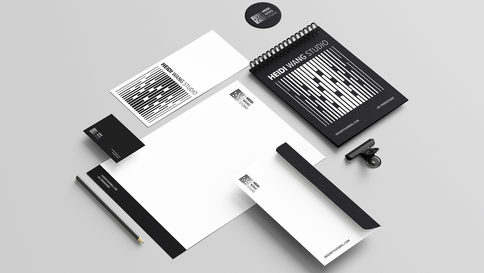
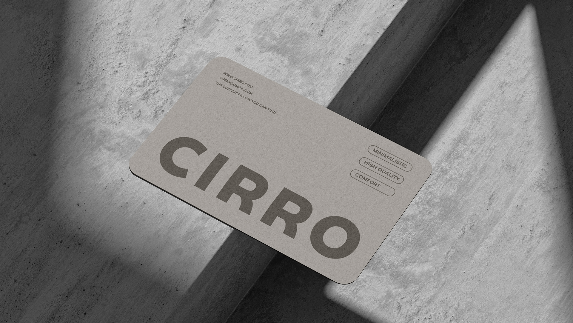
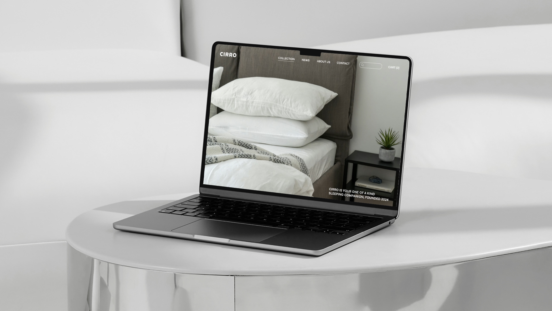
Applying Starpoint typeface to different products
